CREO+ Realtime Collaboration

Role: Lead Senior UX/UI Designer

Overview

In the Creo CAD system on-premise platform, users rely on tools like Windchill to share designs, which require checking out files, editing them locally, and checking them back in. During that time, files are locked for others, making collaboration slow and project tracking challenging.

Creo+ is the SaaS version of Creo, offering cloud-based tools for real-time collaboration and simplified license management. This case study focuses on the real-time collaboration feature over 4 years of iterations.

Goals

Business Goals

Align with market expectations
and other collaborative SaaS design tools

Integrate design review process
previously done via PowerPoint, email, or dedicated tools directly into Creo

User Goals

Improve design efficiency
and team productivity

Reduce friction
across the product lifecycle

Provide a single source of truth
for design data

Design Goals

Introduce a new environment into traditional software
with as seamless an experience as possible

Align to existing look and feel
Use Creo’s design guidelines and maintain familiarity for users

User Needs

  • Access the latest design version

  • Collaborate on assemblies in real time
    to see immediate changes

  • Track design evolution
    keeping it transparent for all collaborators

  • Explore multiple design ideas
    to easily find the best solution

  • Detect conflicts
    between different design approaches

  • View changes made by others
    even when they’re offline

Revisit specific points in time
to review or branch designs

Design Engineers

Use Creo to design various of products, from computer mouse to helicopters

  • Create precise 3D models and assemblies
  • Work independently or in teams on design tasks
  • Validate designs using built-in simulation tools.

Challenges

Introducing a brand-new paradigm

For the first time, something entirely new is being introduced into the Creo ecosystem.

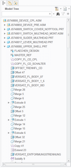
Although Creo is a parametric system with tightly coupled assembly dependencies, the new Collaboration capabilities behave in a fundamentally different way.

The challenge lies in designing an experience that breaks away from familiar patterns yet still feels intuitive and natively integrated into the holistic Creo environment.

Combining New UX with Existing Technology

To streamline development, the business decision was to leverage Creo’s existing infrastructure. One of the main challenges was maintaining a high-quality user experience without compromise.

This required a deep understanding of both the platform’s capabilities and its limitations, continuously evaluating trade-offs, and working in an agile, iterative way to refine and elevate the experience with each development cycle.

Design challenge

Introduce a fresh, modern experience into Creo while staying true to its established look and feel. It required balancing creative innovation with visual and interaction consistency, ensuring that the design feels both new and unmistakably Creo.

Ideation and Design Process

Research Methodology

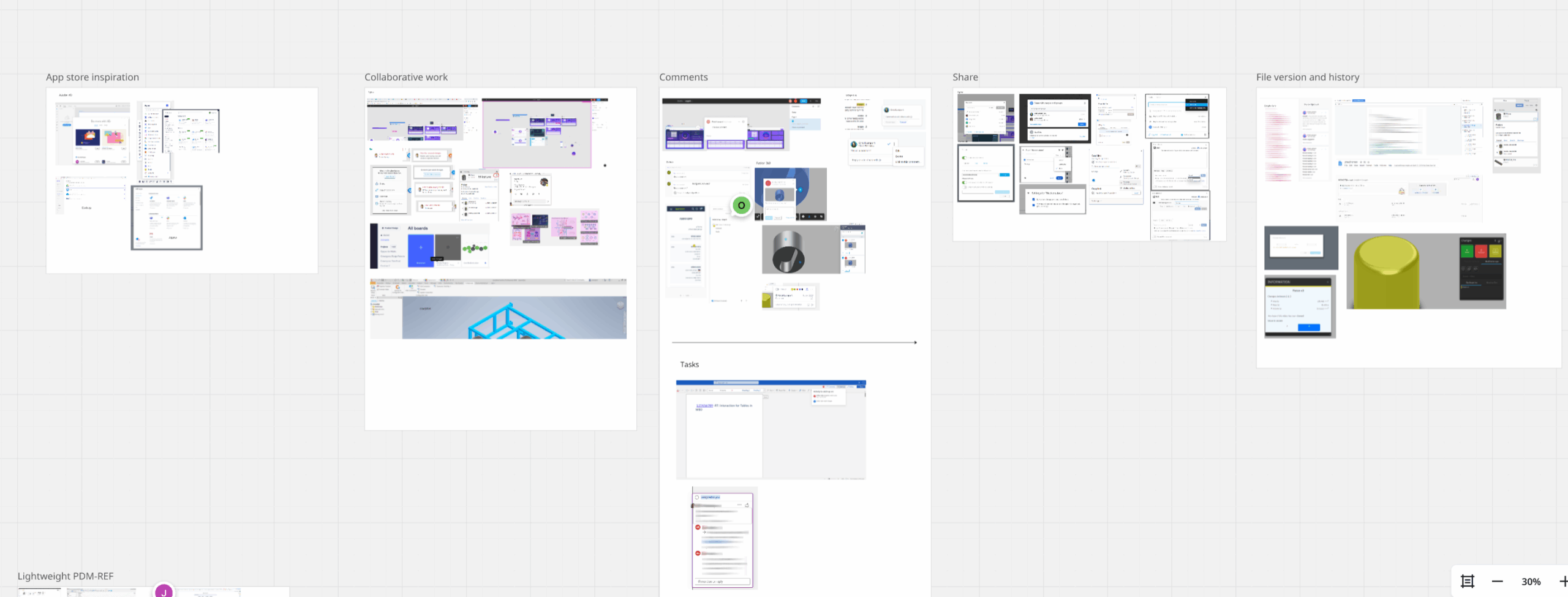
Benchmarking

I focused on collaborative products, specifically, products with history, versioning, and audit trails, and mapped what they have in common, what is working very well.

Usability Labs

As part of PTC’s annual event showcasing upcoming products to Design Engineers and Admins, we conducted 3 usability labs to gather user insights throughout the process.
My role included:

  • Conducting live usability tests with real users
  • Guiding participants through tasks using prototypes and live software
  • Measuring task success and identifying friction points
  • Running short user interviews to understand workflows and needs

Research was conducted over 3 years in 3 phases: Before General Availability, Product announcement, and post release.

Solution

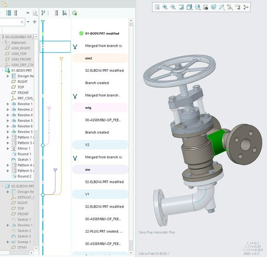
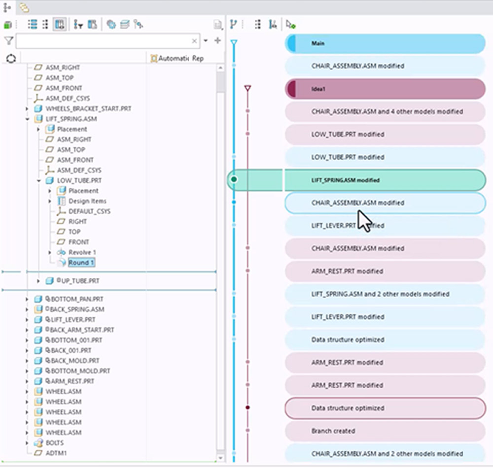
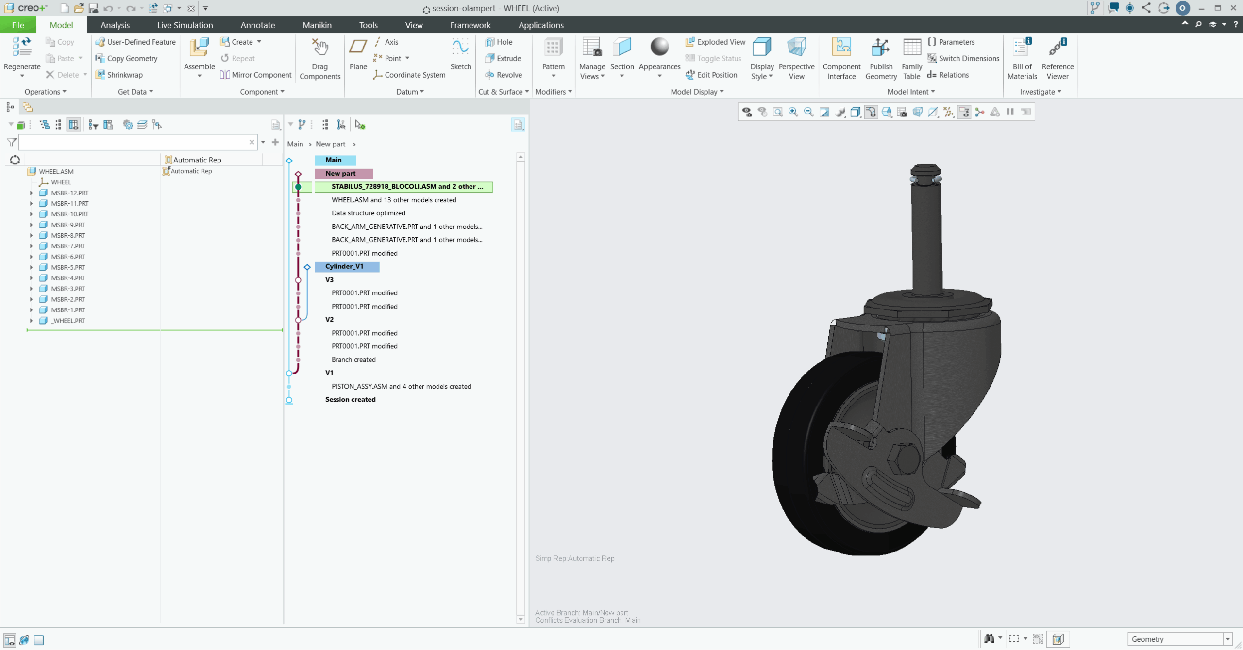
History Graph

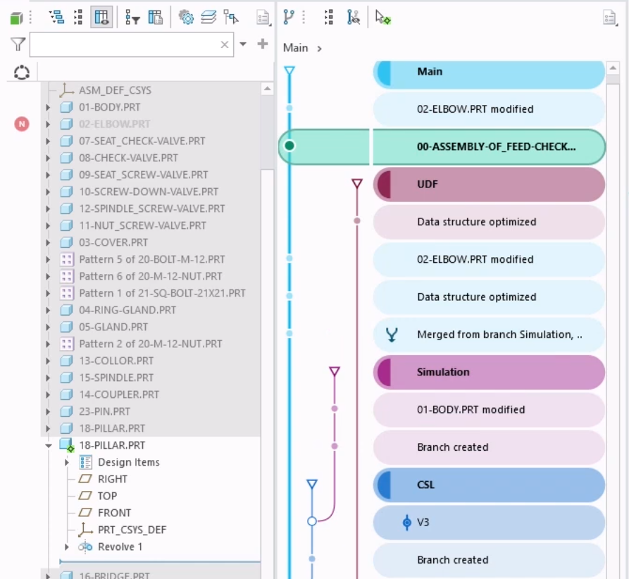
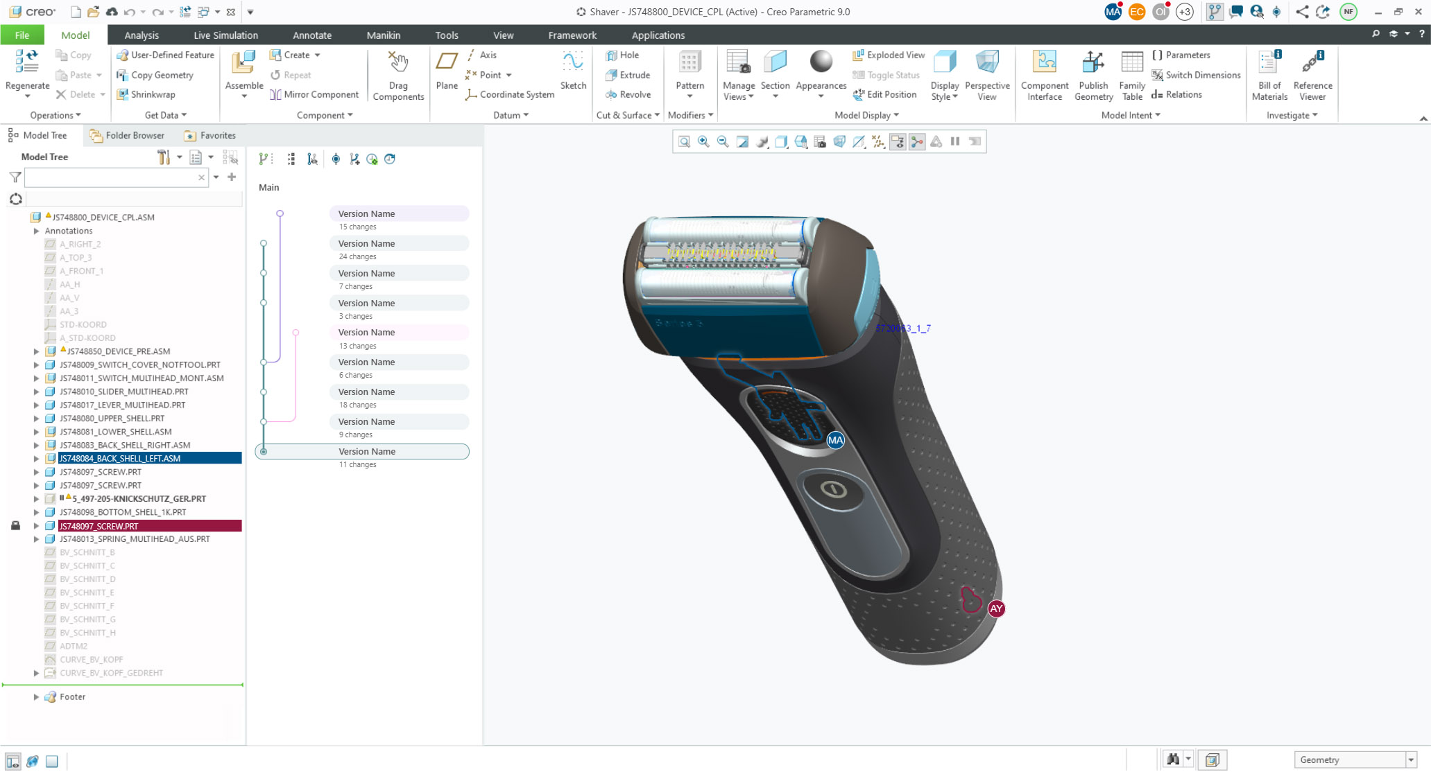
This branched based UI tracks design evolution across multiple users, enabling advanced actions like branch creation and merging.

All actions are auto-saved as entries in the history graph, with key save points promotable to “versions” marking significant design milestones.

An audit trail lets users navigate back and forth between save points.

From Design to Development

2021
High-Fidelity Mockup

2022
Before General Availability

PTC annual events UX Lab Usability Tests

Test were focused on core features, specifically joining a session, autosave, and the history graph experience. For this case study only key findings of the history graph are shown

Key Findings

  • New History Graph felt overwhelming
    and unfamiliar to users
  • Difficulty with understating the design evolution
    caused by a down-up graph direction approach
  • Branches, versions, change points were less clear
    to distinguish
  • The way actions were performed on the graph
    did not match user expectations.
  • Active Branch Node concept needed more polish
  • Additional informative description for changes

    was requested by users

Next Steps

  • Make important graph action more visible like activate latest (activates the latest change in the branch) and create version/branch
  • Active node is more prominent
  • Add an easy way to see the active branch
  • Use colors to make the connection between the different entries more clear.
  • Add tooltip to provide more information about who is currently working on what portion of the assembly.

Balancing design with development constraints

Real-Time Collaboration was built on top of existing code, making structural design changes complex and risky.
To minimize development effort, stakeholders opted to highlight branch, version, and change connections using only color - avoiding any structural adjustments.

2023
Product Announcement

LiveWorks Usability Tests

I initiated two design approach tests to support a more user-centered decision-making focusing on collaborative process:

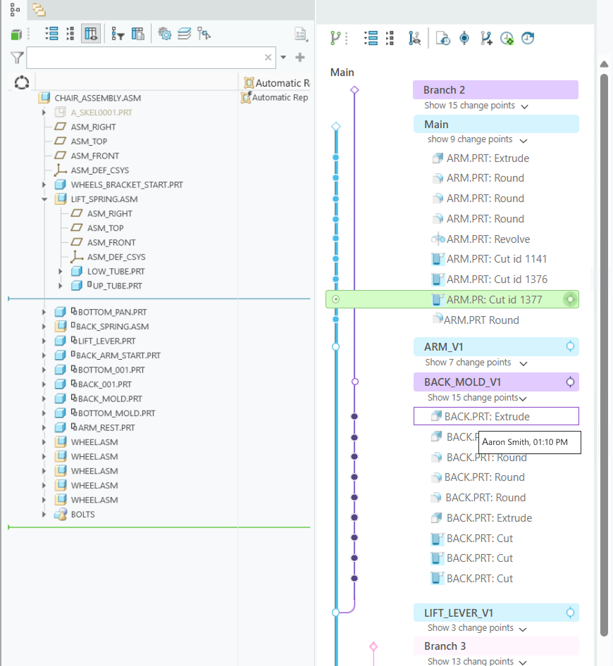
Live Software

Live Software

For evaluation of current implemented improvements.

History graph is timed tracked


Interactive Mockup

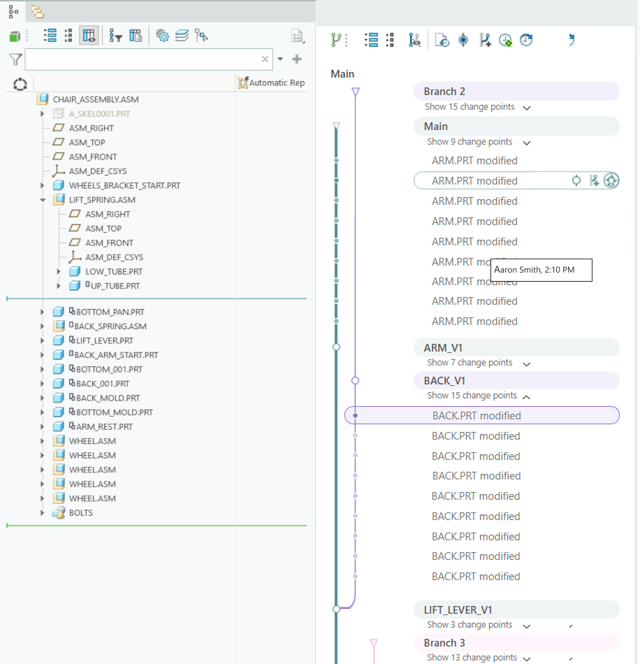
A cleaner structure with grouped branches and reduced color use

History graph is grouped in context

Interactive Mockup

Key Findings

Different Users mental model  than the history graph:

  • Improved clarity
    Users found the mockup’s graph structure easier to understand
  • Less visual clutter
    The grouped design allowed quicker comprehension of changes
  • Preference for grouped branches
    Users didn’t perceive strong links between branches and preferred grouping changes under each branch
  • Better usability
    Tasks were completed more easily in the mockup version

Next Steps

  • Drive the History graph to the next phase.
  • Improve the common issues of the two design approaches.

Research: Major changes in Creo should be done consciously, therefore we started with feasibility research to understand how the grouped approach affects the environment, in parallel get more feedback from the users.

2024
Post Release

PTC/User Annual Conference Usability Test

I initiated another UX study during PTC’s annual conference to improve on previous designs and explore two new areas:

History Graph Restructure

History Graph  Restructure

Align the graph with users’ mental model and onboarding new behaviors

Key Findings

  • Users read the graph like the Model Tree,
    so design was adjusted to match that model
  • Collapsed view reduced clutter
    and mirrored the Model Tree behavior
  • Switching to neutral shapes clarified branch direction
    (last on top)
  • Users struggled with “version” terminology
    suggested using bookmark/milestone
  • Users preferred a grouped view to understand context
    and type of change, not just when it happened
  • Users wants to see a quick look of the design
Contextual communication

Contextual communication

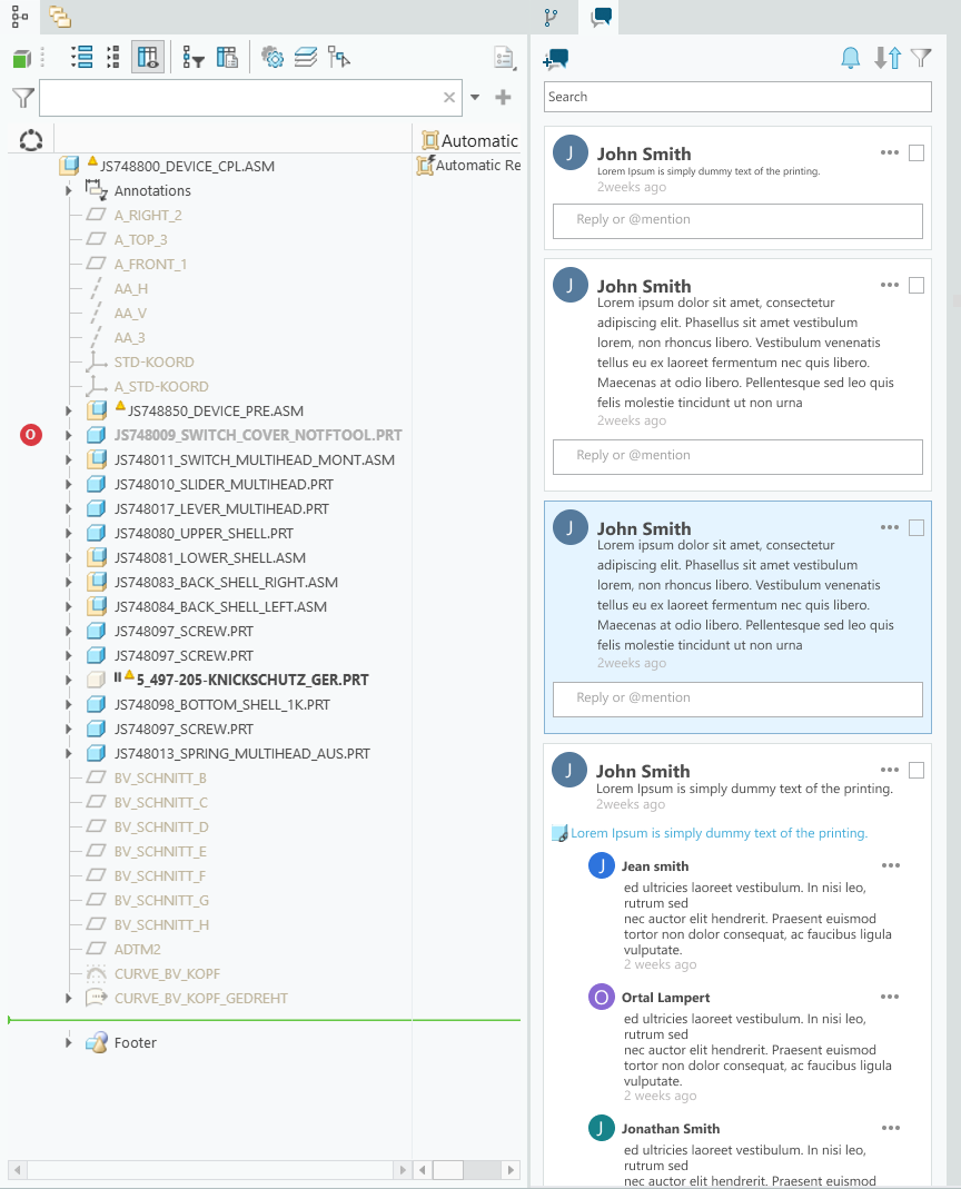
Integrated feedback and discussions within the design flow

Key Findings

  • Feature was intuitive and easy to use
  • All users successfully completed tasks
  • Helped integrate the design review process within Creo
  • Offered clearer change tracking and a single source of truth

Live Product

Reflection & Learnings

1. Users will always surprise you

Users are resourceful and often create unexpected workarounds when facing challenges. Observing these behaviors and listening to their frustrations reveals valuable insights that drive meaningful improvements.

2. Balancing vision and constraints

I aim for the most intuitive, modern UX/UI without initial limitations in mind. Legacy systems and development realities require agility. Designing, testing, and iterating ensures steady progress toward the ideal experience.

3. Designers as advocates

Designers connect users, stakeholders, and developers. By championing user needs and feedback, I have influenced significant changes and delivered solutions that align with both user goals and business objectives.

More projects